Resources
Getting Started
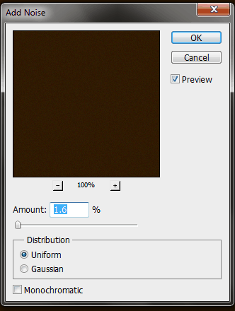
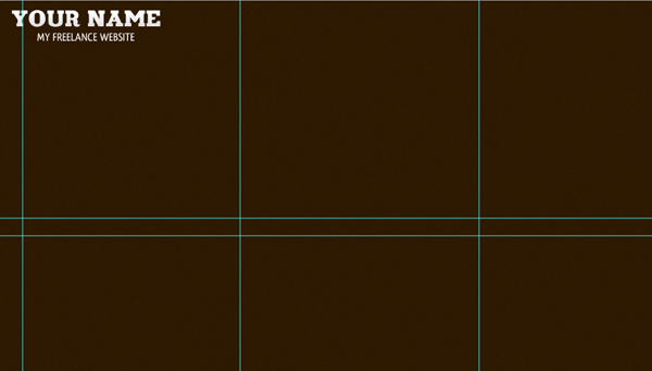
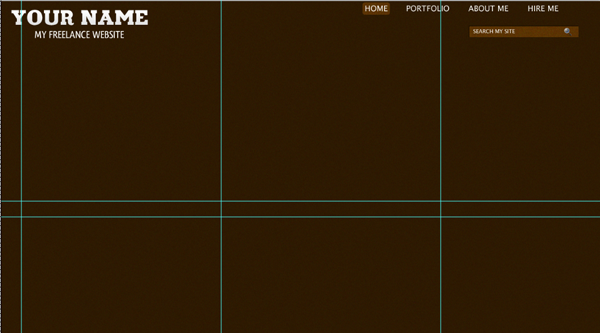
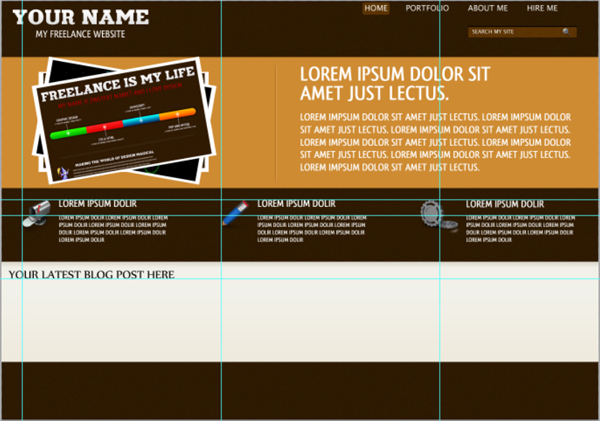
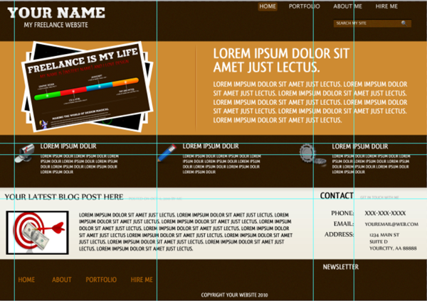
Start out by creating a new document 1366*959 and fill it with #2f1901. Next we will be adding a bit of texture to the background. Go to Filter;Add Noise and use the below value:
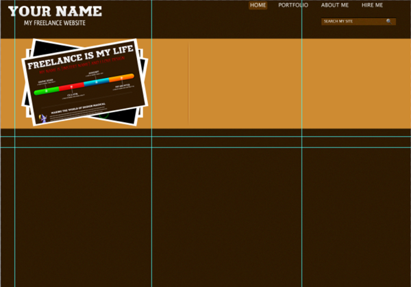
Now it is time to insert the logo. We will be using a text only logo but feel free to use any logo that you would like. We spaced our logo 20px from the top and 20px from the bottom. We used the text Your Name for the main text of our logo and My Freelance Website for the subtext. We centered the sub header on the header and applied the following layer styles to the document:
Once you have your logo finished create a new group and lable it Logo. Place your logo layer styles in that folder.
Navigation
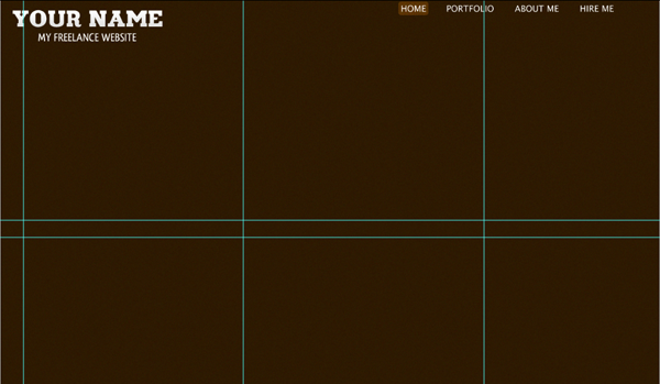
Now to start on our navigation. We will be using right aligned navigation with simple text and a simple rounded rectangle overlay for our hover effect.
For our font style we are using Lucida Sans, White, 18pt, All Caps. Now because our navigation is aligned to the right we are going to reserve create our navigation. Space your final navigation text (in our case Hire Me) 95px from the right side of the screen and 10px from the top.
Now time to start on our navigation hover state. We are going to be using a simple Rounded Rectangle, with a 5px Radius. Set your foreground color to white and draw out a rectangle 62*28 px over our Home Text Layer. Move our rounded rectangle tool to be beneath all our navigation layers and set the Blend Mode to Overlay. Center the rounded rectangle on our Home Layer and space it 3px from the top of our document. You should have this:
Search Bar
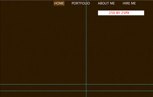
We will now be creating the search bar for our website. Start out by selecting your rectangle tool and drawing out a white rectangle 250*25px. Space it 50px from the right and 35px from the bottom of our navigation.
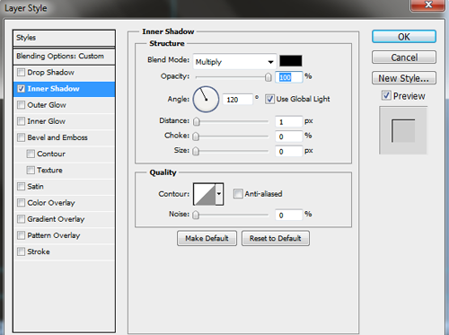
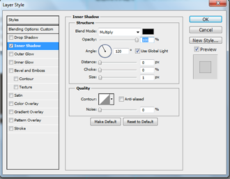
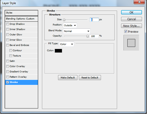
Set your layer to overlay. Now to apply the layer styles. We will be using an Inner Shadow to give our search bar the appearance of being "sunk in" to our document. Apply the following layer styles:
Grab your text tool, using Lucida Sans, 12pt, White and type out Search My Site. Space your text 10px from the left and 10px from the top. Open up the Magnifying Glass Icon from earlier and shrink it down to 18px by 18px and drag it over to our search box. Space it 5px from the top and 15px from the right of our search box. You should have this:
Create a new group and name it Search. Move all three above layers into the group.
Center Content
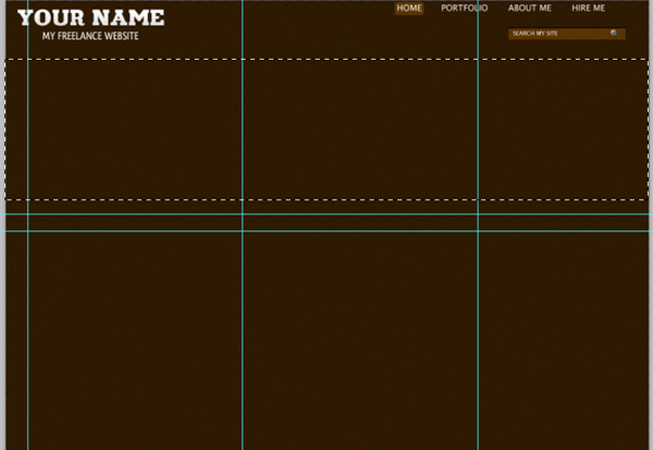
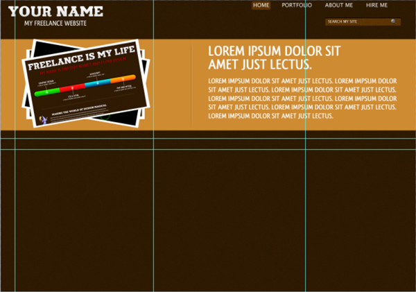
Grab your rectangular marquee tool and select the fixed size style. Insert 1366px for our width and 300px for our height. Click the rectangular marquee tool to create the selection.
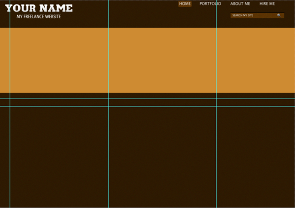
Create a new layer and fill the selection with #CE8B32. Now that layer will be placed wherever you drew your marquee so we need to move it to the right area in our document. We want the layer to be space 45px from the bottom of our search bar.
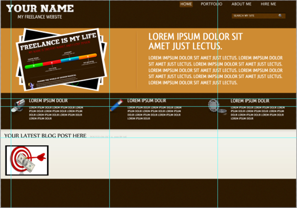
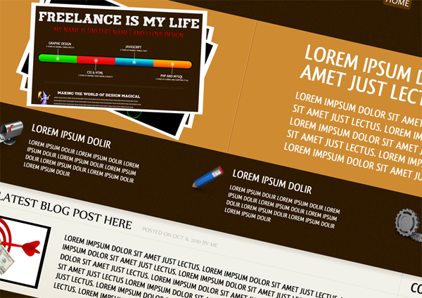
We are now going to be creating the focus of our center content, the images. Grab your rectangle tool and draw out a white rectangle 390*230. Space it 35px from the top and 85px from the left of our document. Now to add our photo. Make a selection of the photo that you want to use that is 390*230px. Insert the photo you want to use. Hold down the CTRL key and click the thumbnail of your photo bg layer. Now right click and select inverse, hit delete. Not hit CTRL+T and at the top change the size to 95%.
We will not merge our layers down by right clicking your photo layer and choosing Merge Down. Repeat the above process three times, choosing a different image each time. Hide your first layer and your third layer.
Now select your second layer, use CTRL+T and change the to change the angle to -10. Now hide your second layer and unhide your third layer. Use CTRL+T and change the angle to +10. Unhide the other two layers so that you have the following:
Now, here you can choose whatver you would like to do. We have our layers in order of creation, 1-3, but you can move them around something like Layer 3, Layer 1, Layer 2.
Time to create our spacer. We will be using the same spacer technique we have used in previous tutorials. Grab your line tool, 1 px, and choose White for your foreground color. Draw out a white line that is 285px tall. Now set that layers blend mode to soft light. Draw out another rectangle that is exactly the same but change the color to black. The two lines should be right next to each other and create a nice "sunken in" style look for our spacer.
Now for bother layers apply the following style:
You will want to space your lines according to whatever content you want to add to the right. If you want more space between your images and content then add more space, if you want less than add less. We are using 135px to space our photos and content. Now add your content to the right of the spacer. This is what we have:
Main Three Boxes
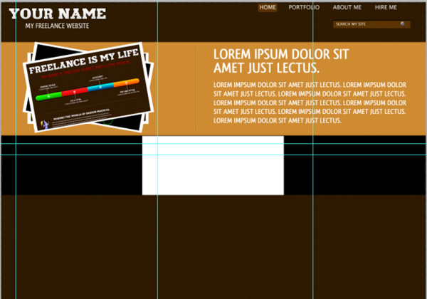
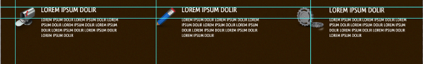
Grab your rectangular marquee tool and make 3 Boxes: 455px * 190px just as a guide for right now. Make each box a different color and stick them back to back. Like the following.
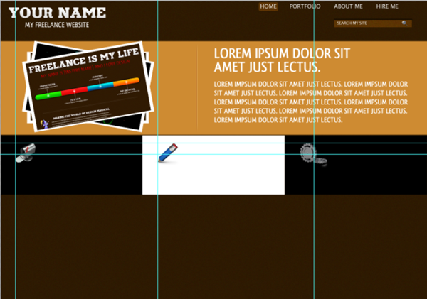
Grab your Mailbox Icon from earlier and space it 50px from the left side of our document and 30px from the bottom of your center layer. Then line it up with the left hand side of your box. Do this for all three icons.
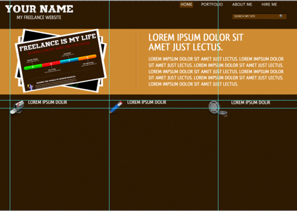
Now delete the three placeholder layers we created earlier. Now grab the type tool style Qlassik Bold, 24pt and White. This will be the header for our document . Space the text 30px from the bottom of your center content and 20px from the left of your icon. Repeat for remaining two icons.
Grab the type tool again style Qlassik Bold, 14pt and White. Space the text 20px from the bottom of your header text and 20px from the left of your icon. Repeat for remaining two icons.
Create a new group and name it Three Boxes. Now take the three icon layers and the six text layers and add them to the group three boxes.
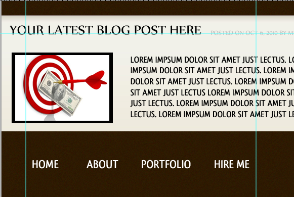
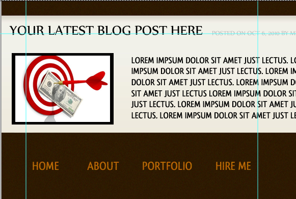
Latest Blog Post
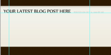
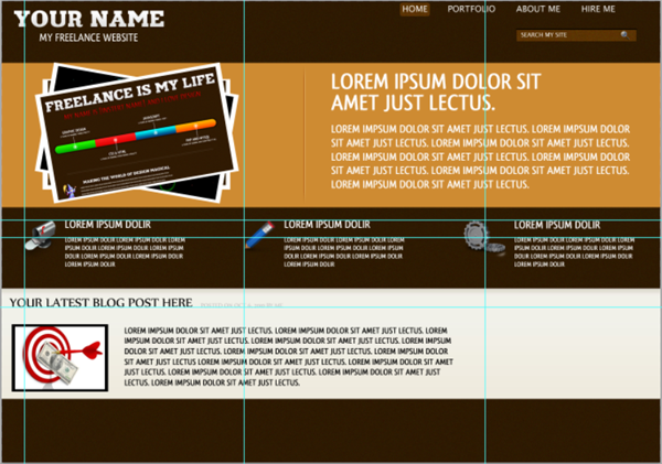
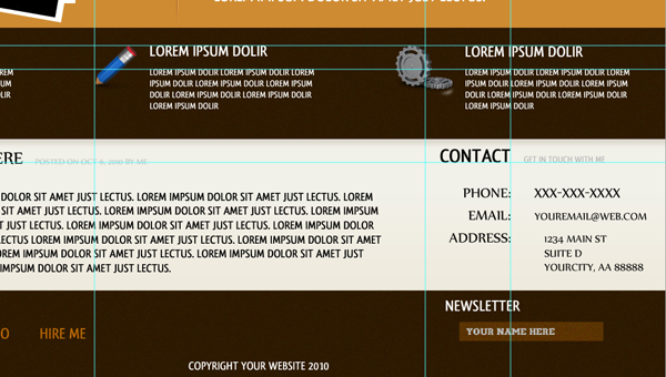
We will be using the rectangular marquee tool once again to create our white latest blog post and contact form area. Change the style to Fixed Size again and make the size 1366*230. Create a new layer and fill it with #f1f1e9. Move your layer to be 45px from the bottom of your three boxes text.
We need to let people know what the box is for so grab your type tool with a style Nyala, All Caps, 30pt, color black and type out "Your Latets Blog Post Here". When coding your website this will reflect your posts name. Space this text 20px from the top of your box and 15px from the left.
Now grab your type tool again so we can add the date the post was made. We will be using Nyala, All Caps, 14pt with a color of #bfbebe. Type out "Posted On (choose a date) by Me". Space it 20px from your blog post header.
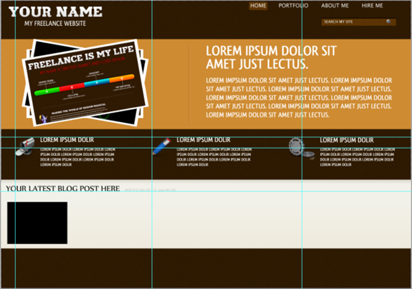
We will now be creating the image thumbnail for our latest blog post. Grab your rectangle shape tool again, using black as the fill color, and draw out a rectangle to be 200*140. Space it 35px from the bottom of your blog post header and 20 px from the left of your document. You should have this so far:
Now grab the thumbnail of your latest blog post (if you have one if not just choose a regular image) and shrink it down to 200*140. Bring the image over and line it up with our black rectangle so that none of the black is showing. We will be using the same process as above to shrink our image down to the right size. Use CTRL+T and change it to 93%. You should have this:
Now we will add the content to the latest blog post. We will be using the Font Style Qlassik Bold, 18pt Color Black for our content. Add your content and center it vertically on our image thumb and add a left spacing of 35px.
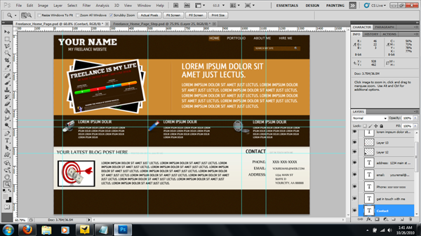
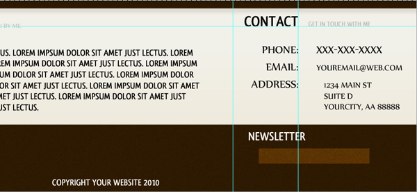
Contact Area
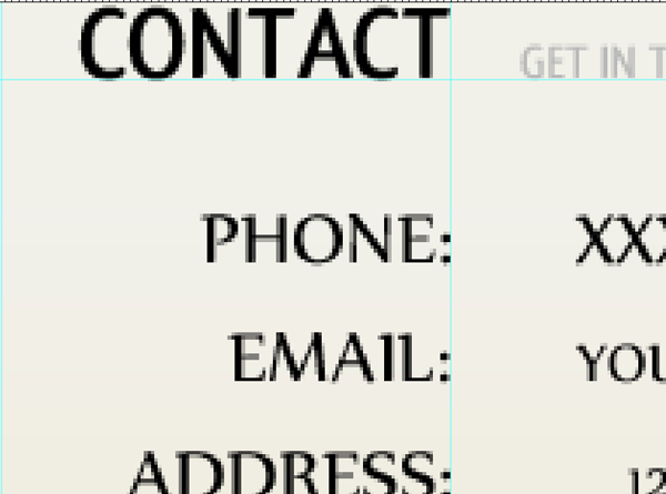
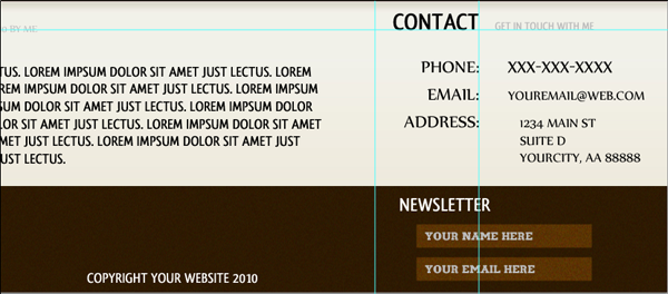
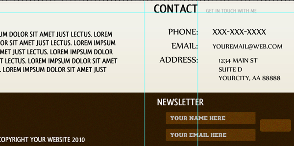
Now to add our small contact area to our home page. The first thing we will be doing is adding the header. Once again we will grab out type tool and use the font style Qlassik Bold, All Caps, 30pt, Color Black. Type out the word "Contact". This will be our header, but we still need to create our sub-header. We will be using the font style Qlassik Bold, 14pt, color #bfbebe. Type out "Get In Touch With Me" and add a left spacing of 20px.
Now you will want to add your contact information. We will be using the Font Style Nyala, All Caps, 24pt, Color Black for the headers. We will be using the same font for the information to the right of it but change the font size to fit it in with the rest.
Make sure that your semi colons line up with the end of the T in contact. Like this:
You should have this so far:
Create a new group called White Box Overall. Now take all the layers you have that are not grouped, meaning the ones we just worked on, and add them to the group we just created.
Simple Footer
We will now be starting on our simple footer. Our footer will consist of three areas; Navigation, Copyright, and Newsletter. Each area is simple in and of itself and is comprised of simple layer styles and blend modes.
Fist off we will be adding our navigation. Grab your text tool with the font style Qlassik Bold, All Caps, 24pt, Color White. Type our your navigation from above (or change it if you wish) and space them 55px between each other, 55px from the bottom of our white content box, and 60px from the left of our document.
Now duplicate your layer and set the blend mode of both layers to Overlay.
Of course you can add a hover state to the navigation if you wish, but I find that adding it to our bottom navigation is adding too much layer styling to the footer.
Our copyright is a simple text style, centered on the document, and spaced 10px from the bottom of our document. Use the font style Qlassik Bold, 18pt, Color White and write out our copyright text.
To add our newsletter we will be using our Text Tool, our Rectangle Shape Tool and our Rounded Rectangle Tool.
Let's start out with our text tool. Use the font style Qlassik Bold, All Caps, 24pt, Color White and type out "Newsletter". Space it 15px from the bottom of our white content box and 220px from the right hand end of our document. You should have this so far:
Now lets grab our Rectangle Tool and draw out a white rectangle 220*30 pixels. Space the rectangle 15px from the bottom of our newsletter text and give it an indent of 20px. Set the blend mode on the rectangle to overlay.
Now apply the following layer styles to the rectangle you just created.
Grab your text tool again. This time use the font styles: Tercio, All Caps, 14pt, Color #bbbbbb. Type out "Your Name Here". Give it a left and top padding of 10px.
Now duplicate your two layers (rectangle and text) and move them down 10px. Change the text to "Your Email Here" so you have this:
Time for our submit button! Grab your rounded rectangle tool with a radius of 5px and drag out a white rectangle: size 75*30. Space it 10px from the end of our previous two rectangles and center it vertically against the two rectangles. Set the blend mode to overlay and duplicate the layer
Now apply the following style to the second rounded rectangle layer:
For the last time we will grab our Type Tool and use this font style: Qlassik Bold, All Caps, 18pt, Color Black. Type out the word Submit and center it on our rectangle.
And here you go!
Wednesday, November 3, 2010
Freelance Home Page PSD Tutoria | Web Layout


via webdesign.org
Subscribe to:
Post Comments (Atom)
No comments:
Post a Comment