Rankmill is a great service which would be popular with young social media users. The kind of people who like to use Facebook applications to share their thoughts with the world.
A typical user might have a relatively short attention span, so it needs to be clear that it’s really quick and simple to use Rankmill.
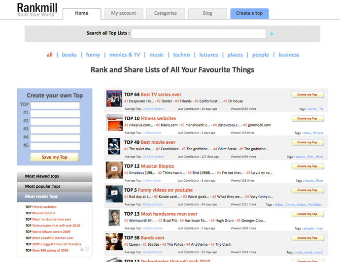
Here is the Rankmill home page before we started working on it
Bearing in mind the target market, and the goal of getting a visitor to create their own Top List, let’s see if there are any areas where visitors might be prevented from reaching their goal.
The page is very dull and grey, it doesn’t seem like it would be fun to use.The term “Create a Top” is probably meaningless to a first time visitor.The “Create a Top” link at top right is part of the main tabbed navigation, which doesn’t really make sense, and it doesn’t stand out.The “Create your own Top” blue box isn’t very appealing or user friendly.The list of Tops is very cluttered and doesn’t make you want to browse them.Aside from the word ‘share’, there is no mention of the ability to share your Top Lists on Facebook etc.In short, it’s not clear what you can do here, or why you would want to do it. If we can make the benefits of speed, simplicity and sharing more obvious, then we should be able to get more people interacting with the site and creating Top Lists of their own.
Here’s an example of a Top List embedded on a website. It would be good to show this on the home page so you can see how it works.
For our purposes, we chose to do a split test (or A/B test). This is a good test to use when you have an overall redesigned page, rather than just testing several different combinations of text changes.
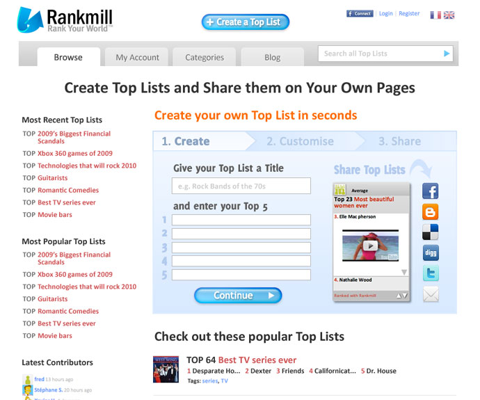
Here is the redesigned home page
What we changed:
Less grey, more colour, the page is brighter and more appealing.Changed ‘Create a Top’ to ‘Create a Top List’ throughout for clarity.Made the tabbed navigation neater, and removed ‘Create a Top’ from the main nav, making it into a button instead.Moved the ‘Create a Top’ box to the main column and made it the main feature of the page. It is now a three step process that lets you create a Top List right from the home page.The benefits are clear – ‘Share them on Your Own Pages’, ‘Create in seconds’, and the social media icons make it clear what you can do here.The list of Top Lists is much clearer, with more white space and less text.We expect that the changes we have made will increase the number of visitors who go on to create their own Top Lists. We will look at the test results over the coming weeks to see if our prediction is correct, and use these results to formulate possible follow-on tests to further increase conversion rate.
Results of the test will be posted here once we can see a clear winner.
In the meantime, check out Rankmill.com, and start sharing your own Top Lists.
View the original article here
Thursday, November 4, 2010
Case Study: Increasing conversion rate using Google Website Optimizer | Everything Web Design
Subscribe to:
Post Comments (Atom)
No comments:
Post a Comment