Intro
The difference between good and great webdesign is relatively small. The average person may not be able to explain the tangible differences that make up great design, but they can usually spot a design they like. By examining some awesome sites, I'll attempt to put my finger on some of the small details that make up the difference.
This post is chock full of awesome examples. I made a conscience effort to only pick sites that were great all the way around.
1. Make Subtle Use of Gradients
I'm not sure if there is an effect that can be butchered and make your site look more amateurish than poor use of gradients. Nothing screams bad design quite like a rainbow gradient (well perhaps blinking text is of equal prowess). That being said, the use of subtle gradients will go a long way toward making your site look great. The key is using them sparingly within the flow of the design.
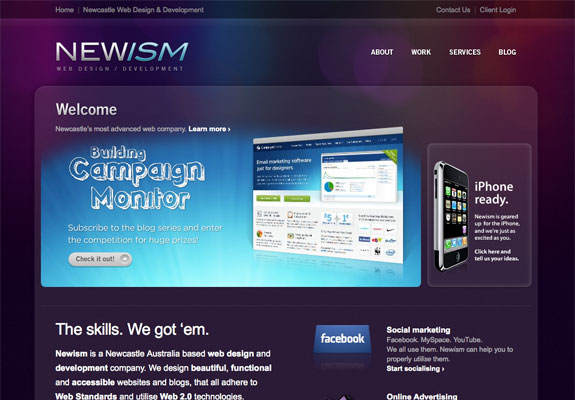
Gradient Meets Bokeh Effect
The Newism site features a colorful, but subtle gradient that is seamlessly mixed with a faint bokeh effect. It's visually stunning. Just as a side note, if you are interested in recreating a bokeh effect in photoshop, be sure to check out Abduzeedo's tutorial on it.
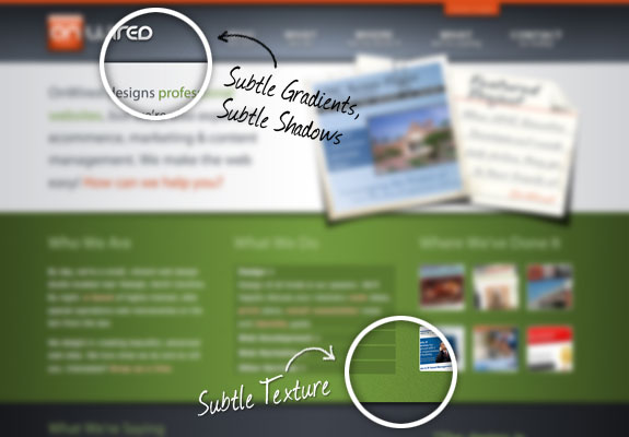
Subtle Gradients, Shadows and Textures… Oh My!
The guys at OnWired flat-out make awesome websites, so it stands to reason their personal site would be top notch. To go along with plenty of personality throughout, the design itself is spot-on. Check out the use of subtle gradients and shadows in the design. I also love the touch of grunge and texture that is sprinkled in.
2. Add White Space
The term white space is often misunderstood to literally mean white space. In terms of design it is more accurately described as the space between elements. To break it down even further here is how the folks at A List Apart define it.
"Whitespace," or "negative space" is the space between elements in a composition. More specifically, the space between major elements in a composition is "macro whitespace." Micro whitespace, is-yes, you've guessed it-the space between smaller elements: between list items, between a caption and an image, or between words and letters. The itty-bitty stuff.
It cannot be understated just how important it is to let elements breathe in your design. This is probably the single biggest issue for young designers. It's human nature to try to cram every design element into a small area, fortunately for webdesigners (despite every clients unrelenting belief) there is no such thing as a fold in webdesign, that's what scroll bars are for… /* end rant */
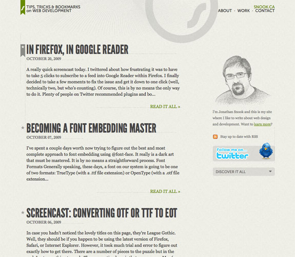
Excellent Spacing & Subtle Line Breaks
Snook provides a comfy level of padding to break up all the post entries. Also notice the faint line breaks that provide separation, but are easy on the eyes and flow with the overall design.
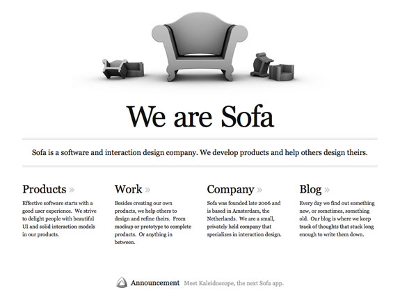
Beautiful Minimalistic Approach
Made By Sofa features a beautiful minimalistic approach. The spacing is fluent, and they use an image with no background or clutter to speak loudly.
3. Stay On A Grid
The inspiration for grid based designs can best be attributed to newspapers, but if you look closer you can find grids in all kinds of things. From most websites to traffic grids.
The 960 grid and Blueprint are probably the two most popular grid frameworks. I personally love the 960 grid, it's simple, light weight and a nice starting point. I design with it a lot of the time, but a grid just means that you have some rhyme and reason to your site elements. Alignment plays an intricate role in making your site look refined. Nothing in webdesign should be placed without purpose or alignment to another element.
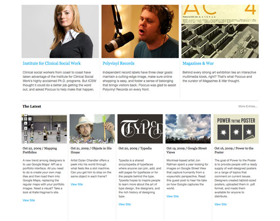
Griding A Portfolio
Poccuo features their portfolio on their home page. They use a beautiful mix of a 3 column and 5 column look. It's well spaced and visually appealing.
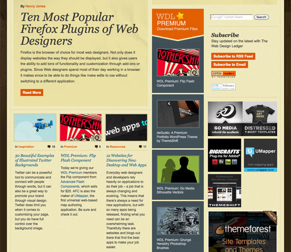
Columns Within A Design Blog
I love how Web Design Ledger presents their posts on their home page. The newest post is large and featured at the top, the next few are shown in a 3 column grid.
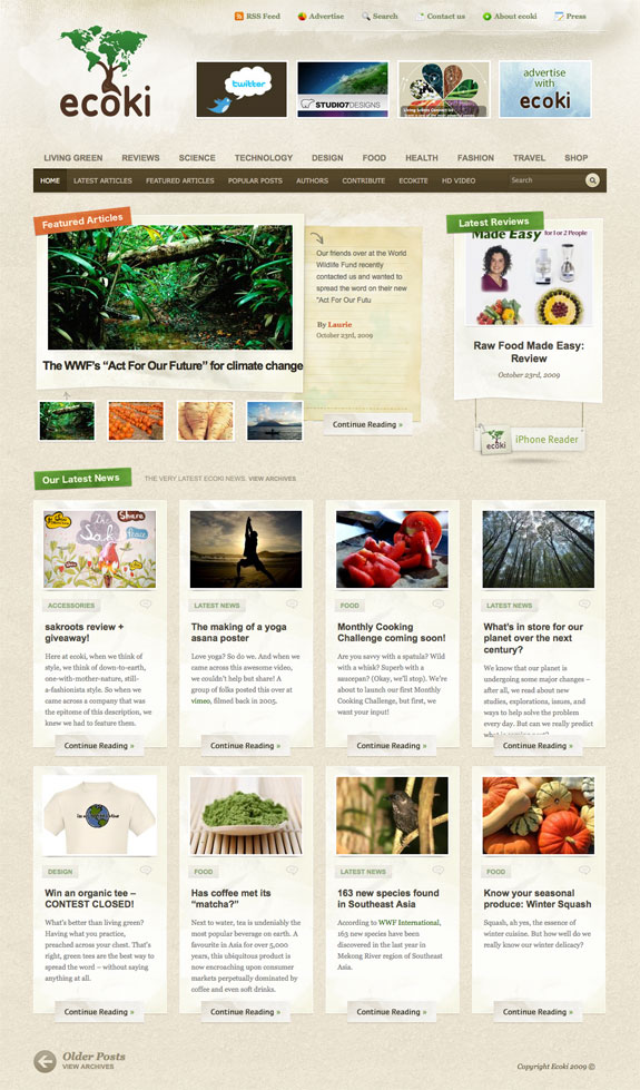
Lots of Equal Length Columns
Ecoki is a beautiful grid design layout. The 4 column, 2 row layout is obvious, but the slideshow/thumbnails and latest reviews are also on a grid.
4. Improve Your Typography
Typography is an artform that is obsessed on by most good designers. It is of prime importance when trying to bring your designs to the next level. Of course it plays an important role in readability, but it's also quite important to design and mood.
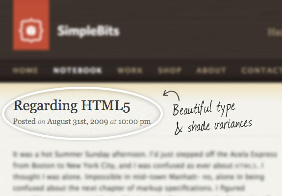
Using Contrast To Direct Attention
SimpleBits does a wonderful job of varying contrasts to direct the viewer's attention. In typography contrast can be altered through font choices, color variances, and size differential.
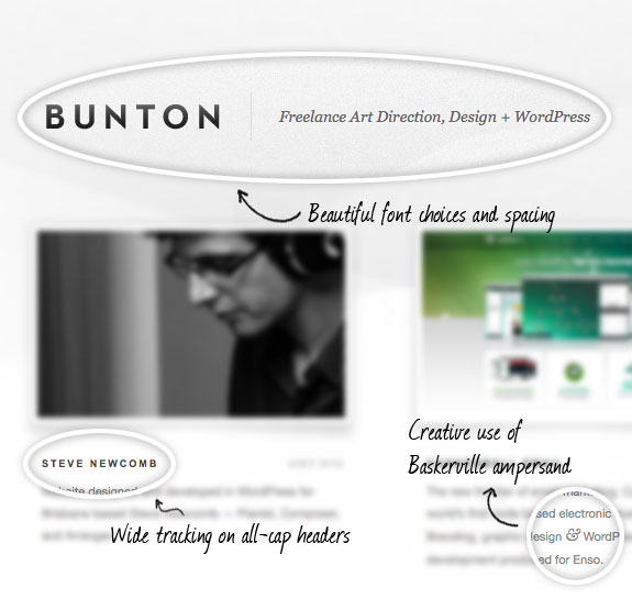
Nothing Says Typography Like Ampersand Signs
This site looks so nice and effortless, but you can tell a lot of thought and reason went into the whole process, and that's especially evident with the typography. The spacing and font choices are flawless, and I'm enamored with the clever use of Baskerville on the ampersand signs.
5. Have Clear and Effective Navigation
Good navigation is so important in design. If a user can't find what they are looking for quick enough, they are probably moving onto the next site. It's something I'm very weary of, and I know that MyInkBlog could use some improvement on, and it should be drastically improved in the coming redesign.
Blog Navigation Via Categories
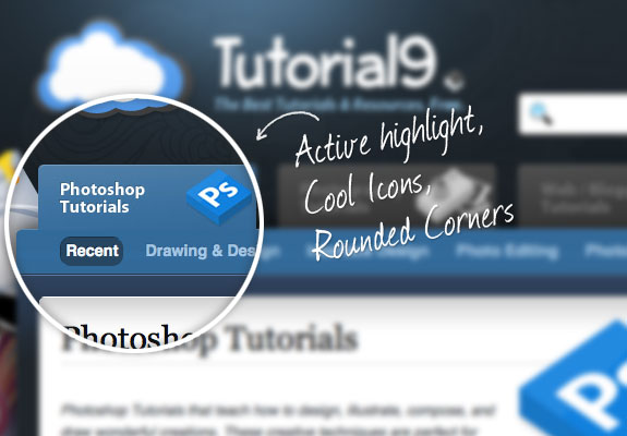
Far too often, blog navigation focuses on pages and leaves the categories as a secondary thought somewhere along the sidebar. Tutorial9 does a fantastic job of realizing users care much more about finding out where their photoshop tutorials are, than where their about us page is. Check out their flawless 2 level navigation with active category highlighting.
Effective Icon Hover Effect
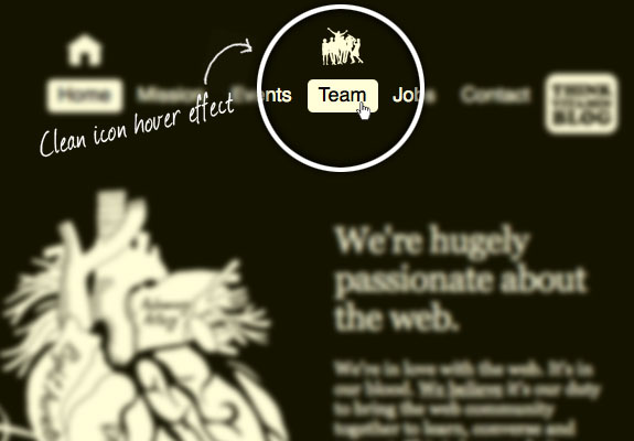
Icons can definitely be hit or miss on websites. The web is filled with the remanence of this web 2.0 trend, but not all trends are completely bad. The reason web 2.0 got ugly was because of it's overuse and amateur use. As with most things, when done properly it really can be quite effective. Carsonified displays a clever icon hover effect for it's navigation. It's simple and monochromatic and ties in flawlessly with the rest of the site design.
6. Use An Awesome and Useful Footer
When the web first started footers were tossed into the junk pile of useless things. They were minor, but necessary evils that needed to be displayed, but little thought went into the design of them. Now they've become more and more important to the overall design of a site. Don't miss out on the opportunity to brand and complete your design through the use of a good footer.
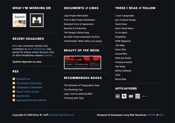
Lots of Info & Credentials
The main purpose of a footer is to display necessary info about the site and copyright info. Brian Hoff adds more personality and interest to his through a 3 column look that displays everything from what he's working on to books he recommends.
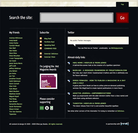
Search Functionality In A Footer?
Elliot Jay Stock's site features an oversized search form in his footer. It's definitely not a typical place for one, but I think it works for his site. He is also one of the many designers who have taken to featuring their tweets in the footer.
Final Thoughts
I'd love to hear your thoughts on the subject. What separates great design? What little things do you key on?
Wednesday, November 3, 2010
6 Ways To Take Your Webdesign From Good To Great | Web Design Principles
via webdesign.org
Subscribe to:
Post Comments (Atom)
No comments:
Post a Comment